


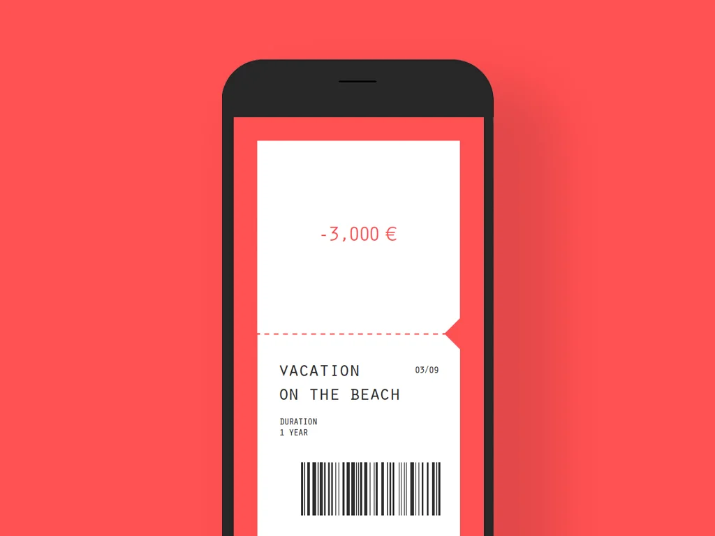
Dominican republic is the country with the highest teenage pregnancy rate. In this county where abortion is illegal under any circumstance, more than one in 10 teenage girls became pregnant in 2013 and the rate is still soaring. Along with poverty and legal sex trade, these figures are mostly attributed to the lack of sexual education at home and in schools.
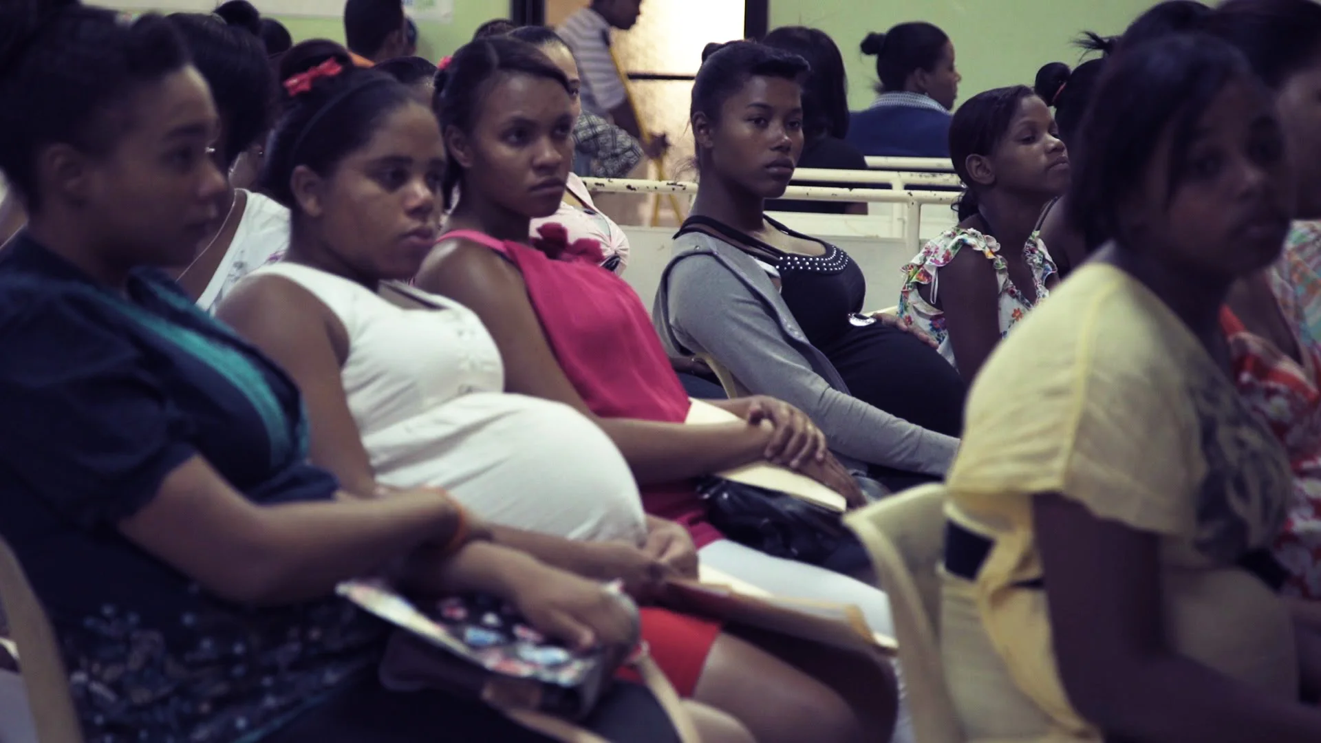
This project explored current sexual education experience of teenagers in Dominican republic, to understand behaviours and gaps in the interaction between teens and sexual education system. It brings together designers and stakeholders in the sex education sector to go through the human-centred design thinking process to create a mobile application that improve sexual education system and prevent adolescent pregnant in the country.
The app will be launched in google play store in late 2017.
Key Design direction
One of the main challenge that Dominican teens currently has is the taboo against opening about sex related topics. To break it in and create a sustainable influence, it aims at following directions: The user should quickly access and browse the contents. The user should feel secured by using the service and see that contents are transparent and trustworthy. As a long-term goal, the user should reach and through the sex educational program and the health care in the community and adopt healthy behaviours.
Key User story
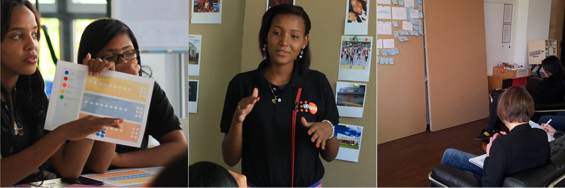
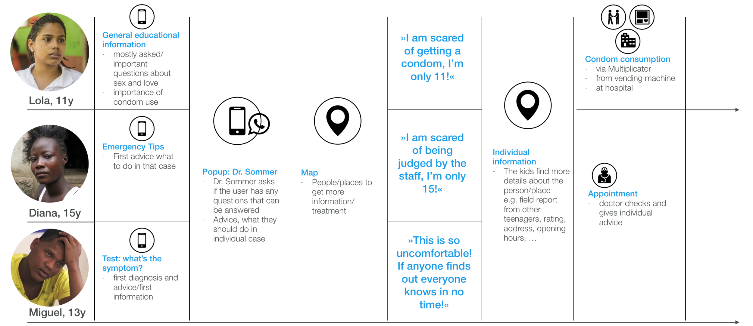
After collecting and analysing user research data, 3 user stories and personas were developed to address characteristic issues that the research participants have. They are used as a reference point when creating solutions and developing the concept.
Key Design solution
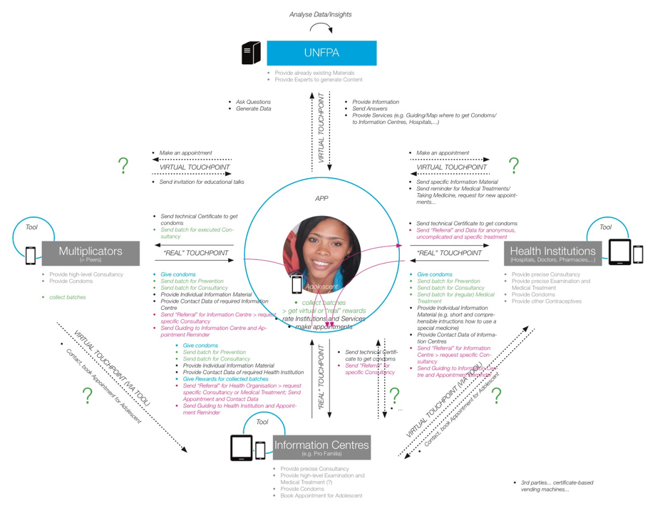
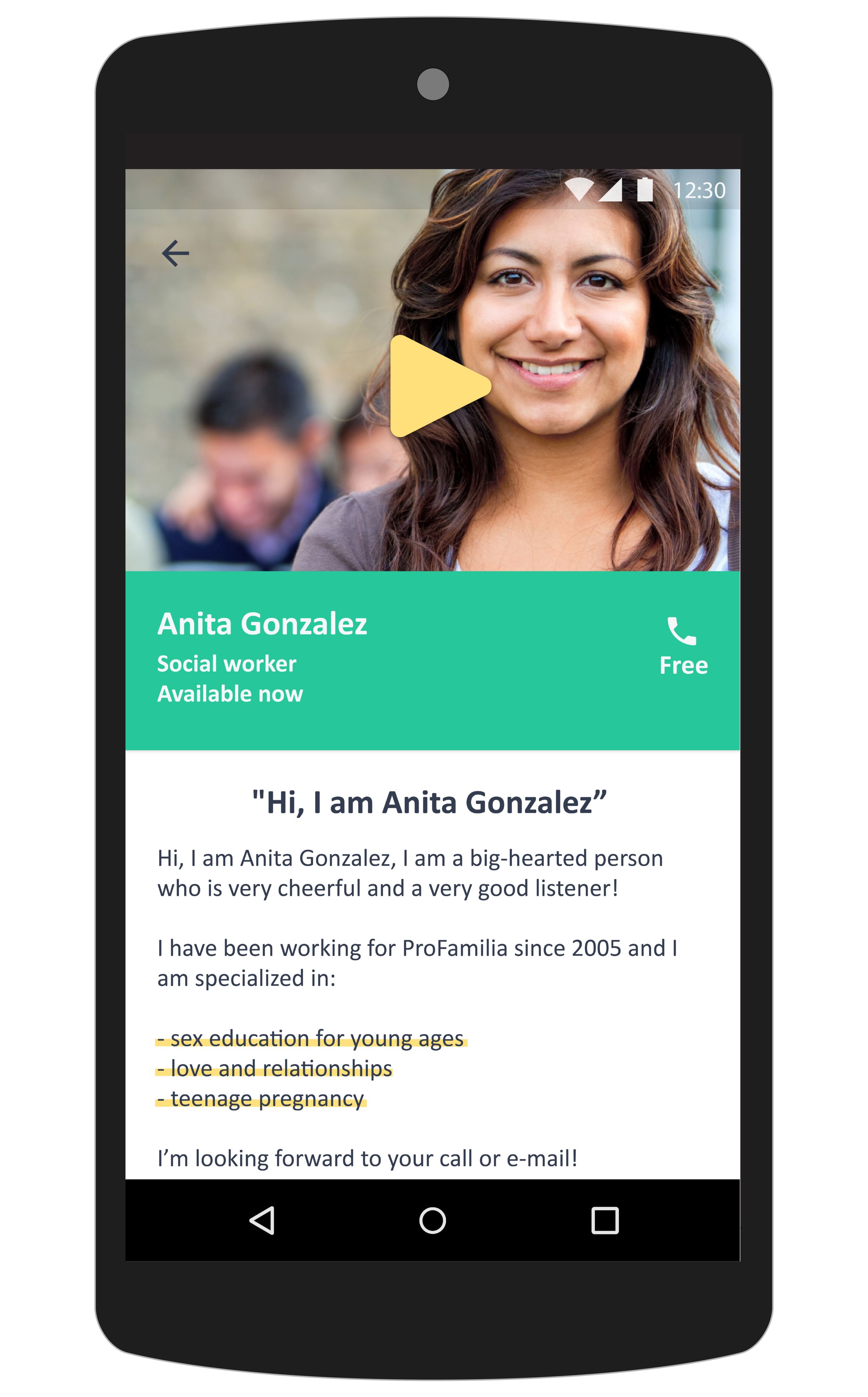
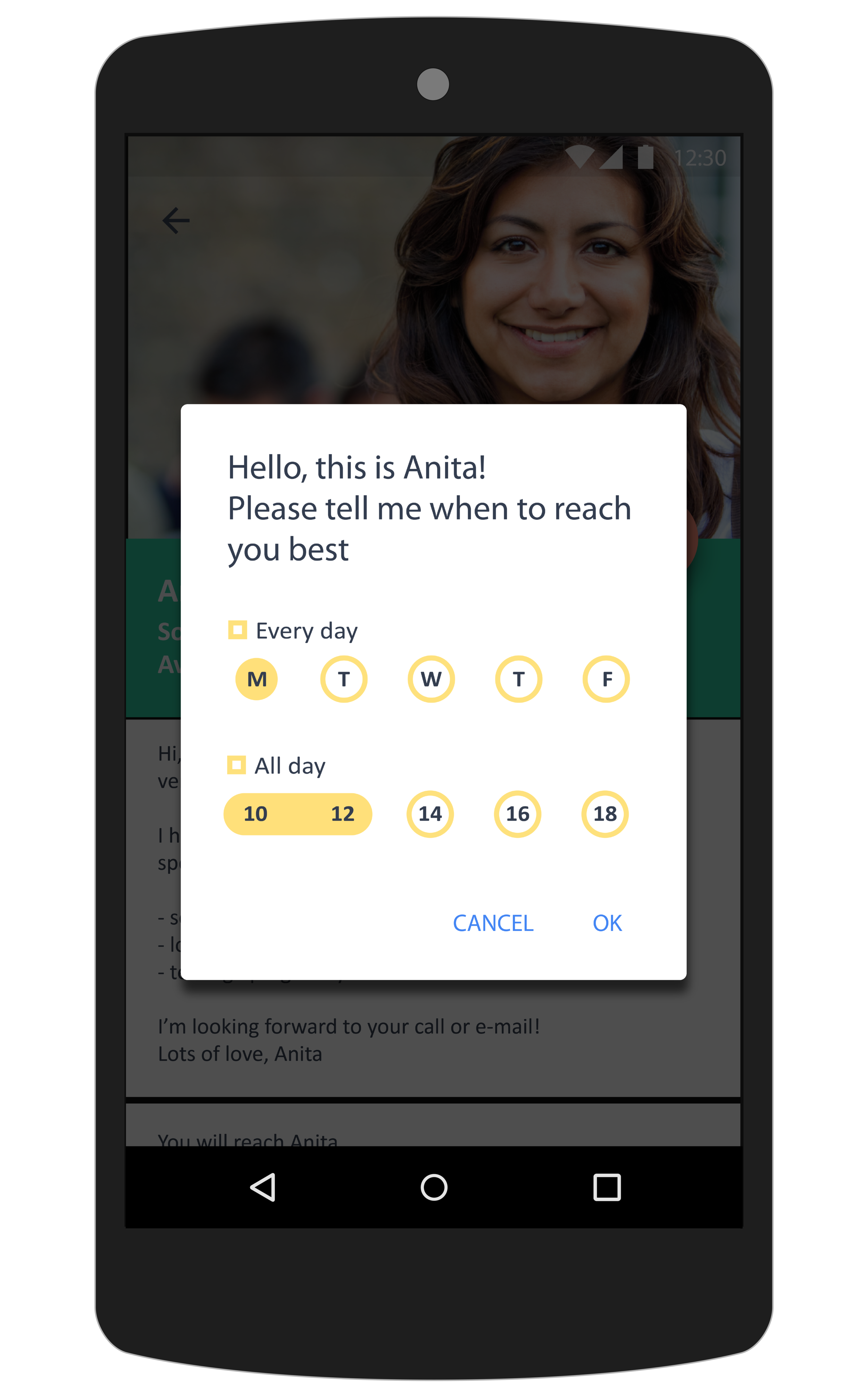
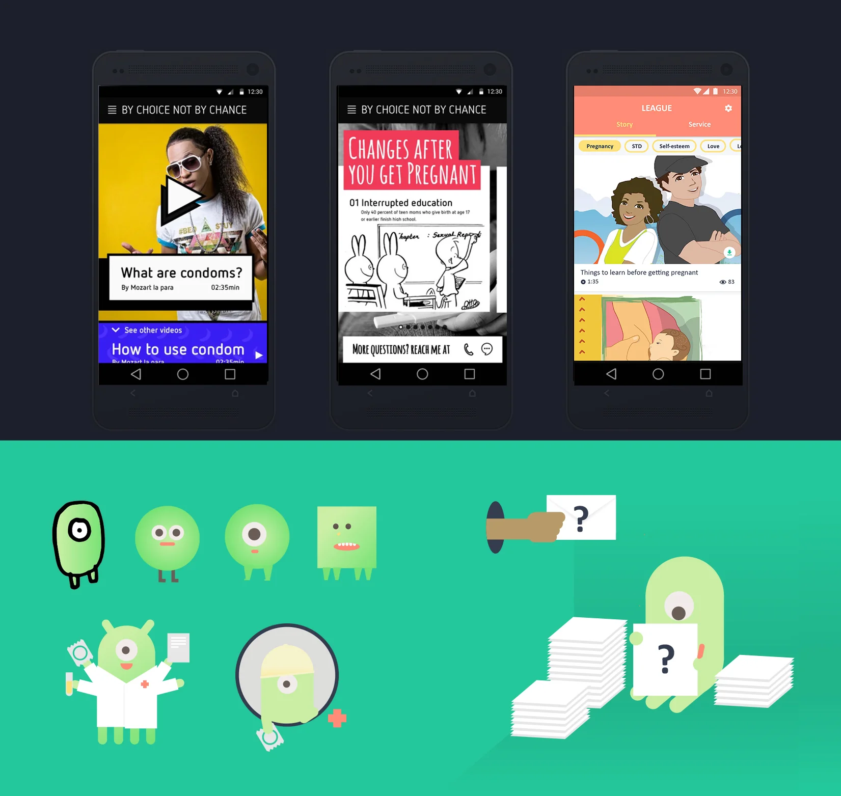
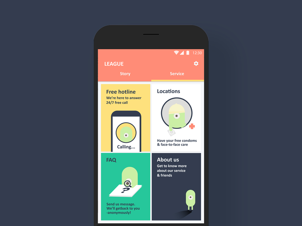
Designed for teenagers who want to get transparent information and need to get urgent help, the the platform enables to provide informational contents and encourage the user to access to health professionals in community through both, ‘virtual’ and ‘real touch points'. The adolescent gets in contact with those touch points by using the Smartphone. It becomes a tool that not only gives access to information. It gives access to contraceptives and is a communication channel for individual needs by making ‘real touch points' accessible, less scary and more attractive.
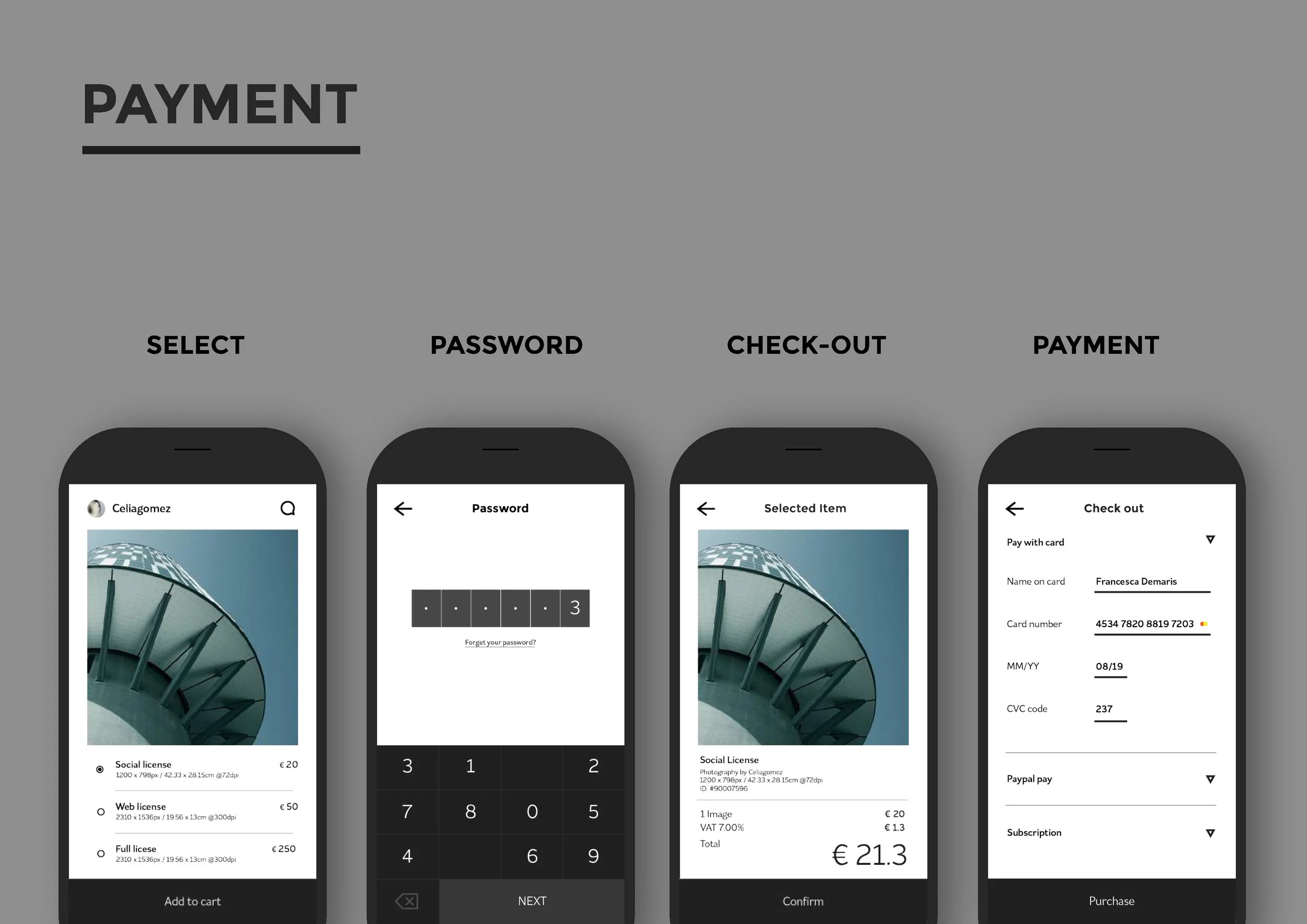
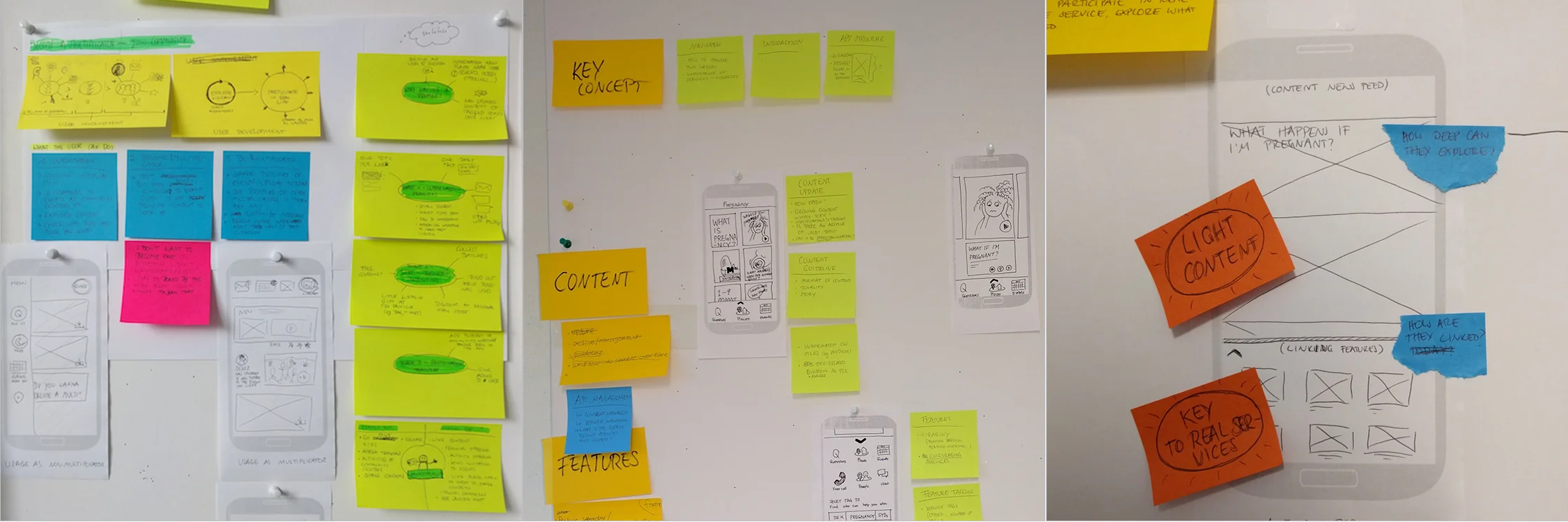
Ideation & Prototype
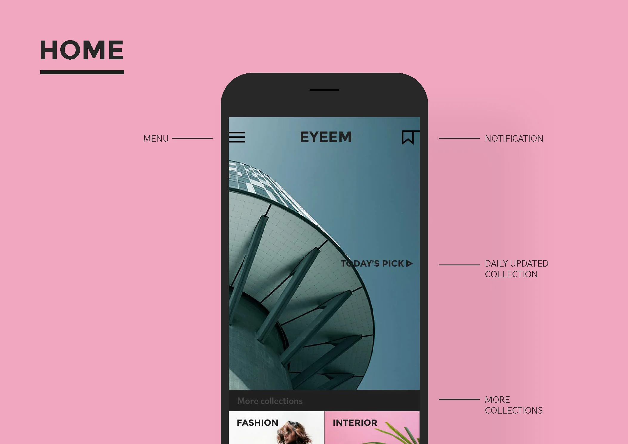
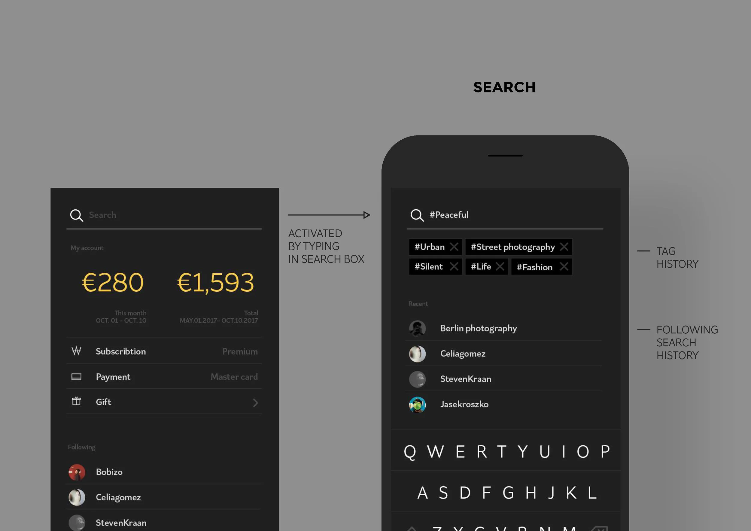
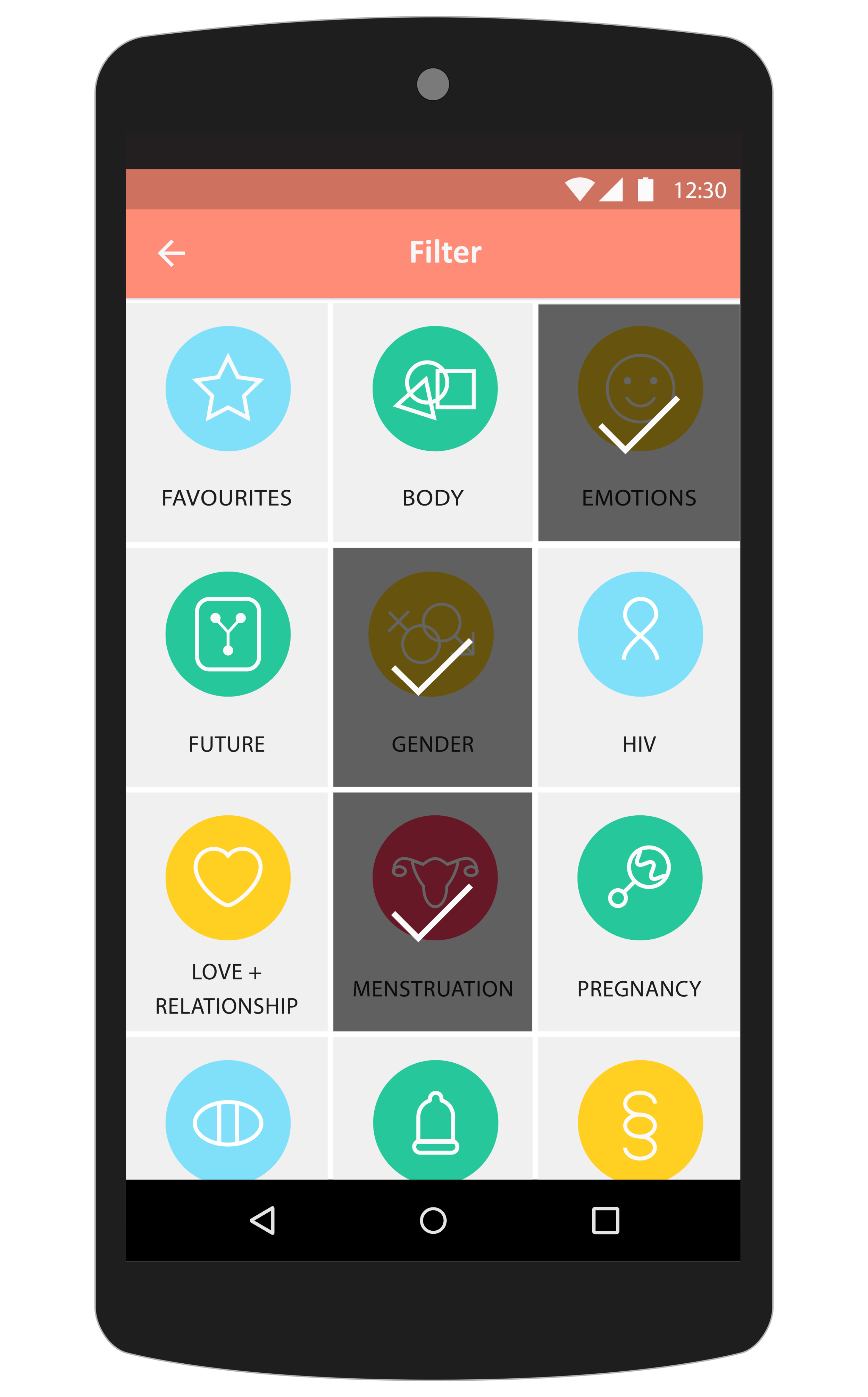
In the main structure, it is clearly divided into those two area: browsing area and navigation area.
Browsing area provides bite-size contents about the most engaging topics picked from the survey of Dominican teenagers. Navigation area guides to the 'real touch points' provided by UNFPA with the free chat & call, and the map feature. Through testing, I created different methods to combine two touch points and discovered the right balance of the contents size and flow. During the process, the methods were defined together with a front-end developer and a project manager.

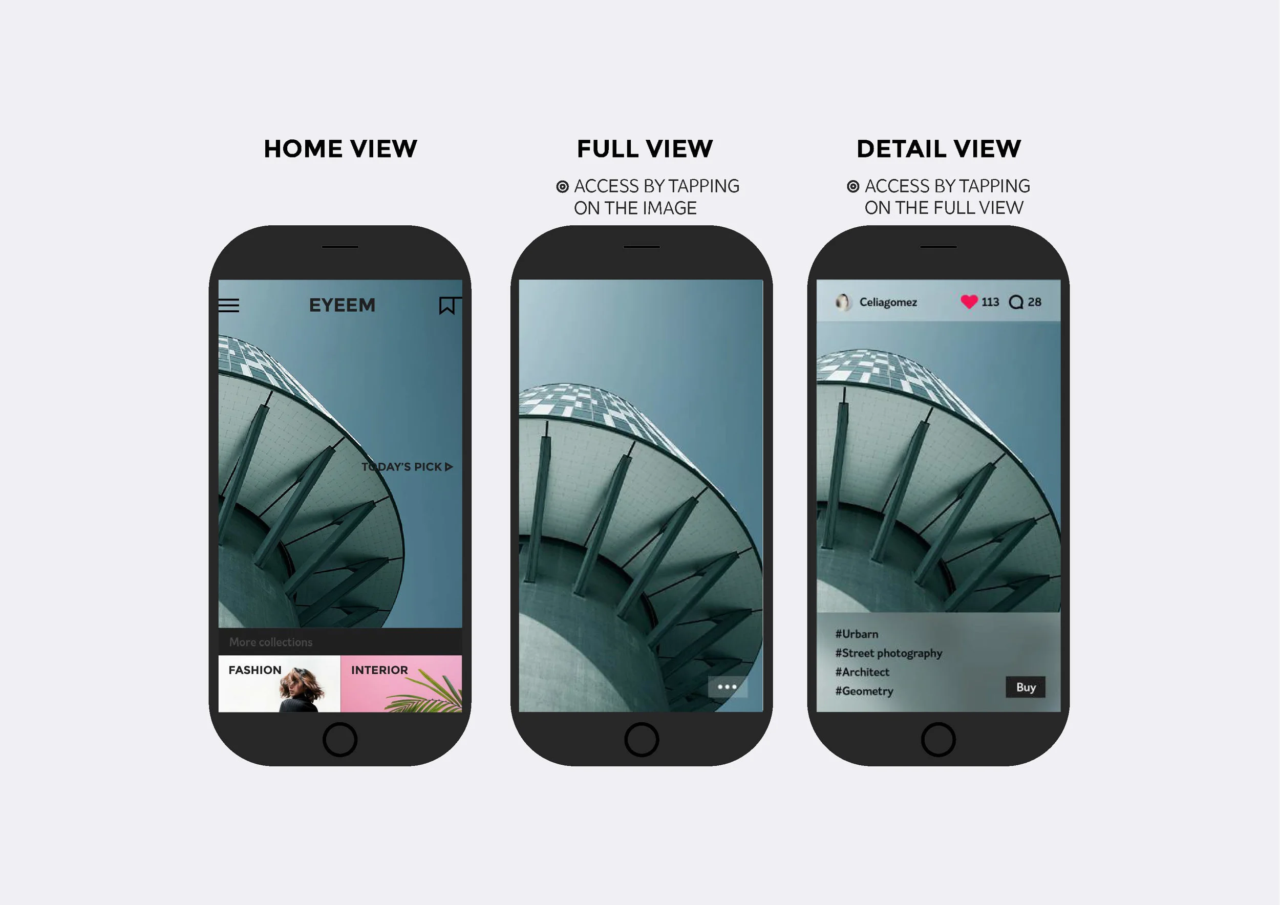
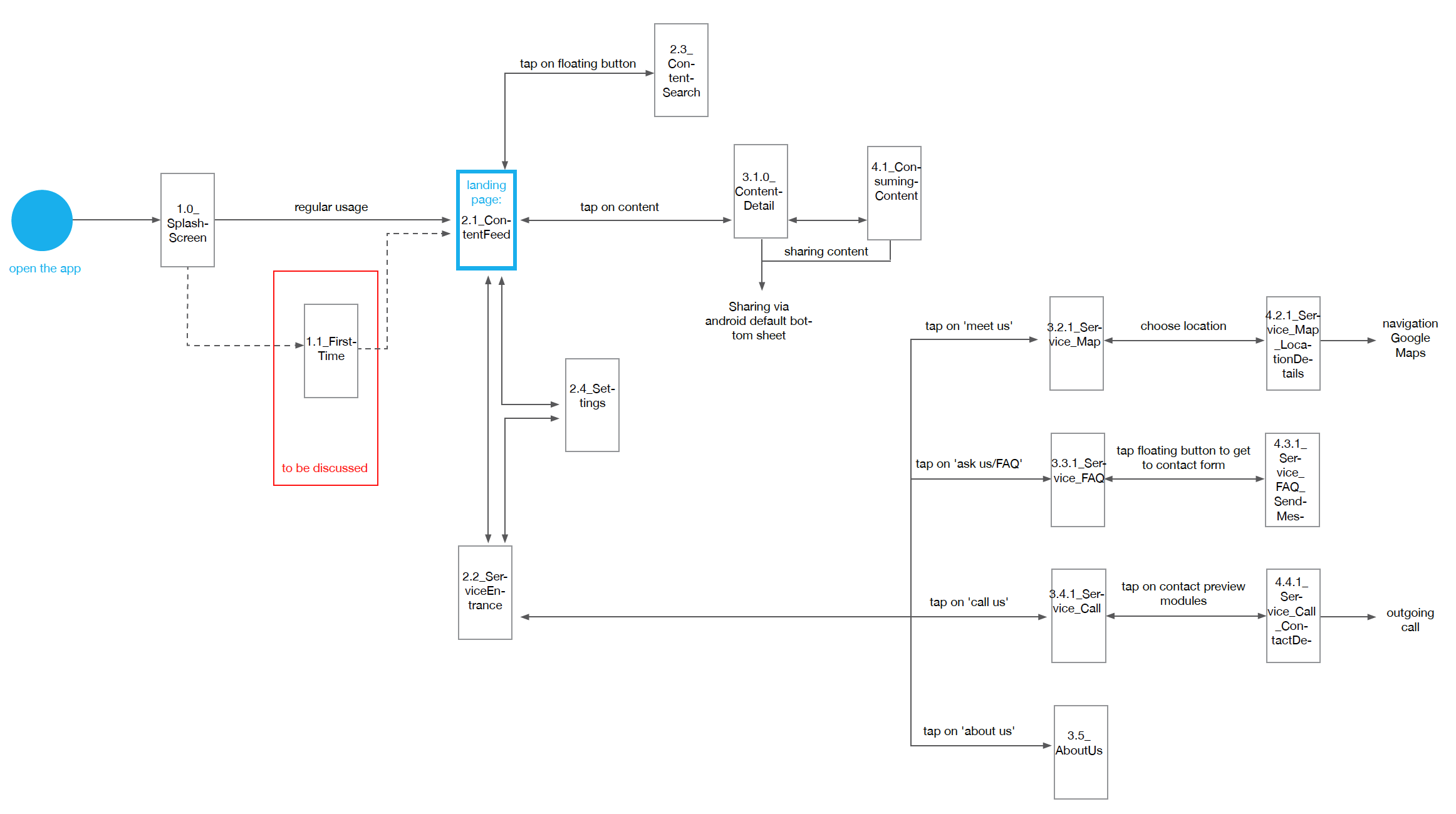
Wireframe
After iteration, main interaction models were defined and documented for the front-end development. Below are general screen flow of the application.
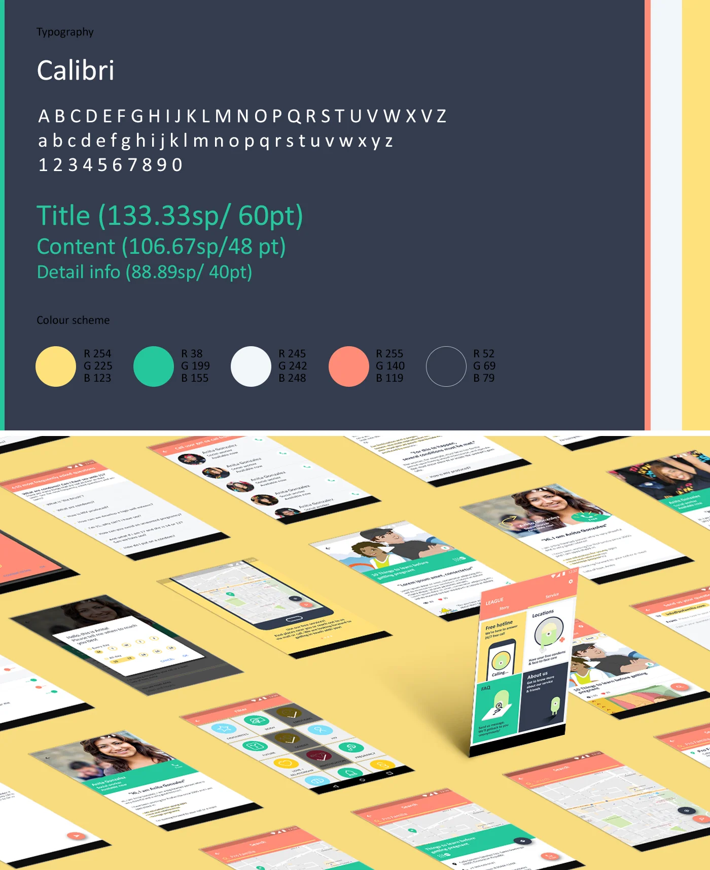
Visual design
The visual tonality of this application is the key to the communication with teenagers about sensitive topics. To find out the most appealing visual language, I developed several visual languages and method: Contemporary, Cartoon-styled, colourful simple, and characters driven. After that, through A/B test with internal designers and Dominican teen ages, final design was chosen.
Prototypes
DESIGN GUIDELINE
DESIGN EXPLORATION
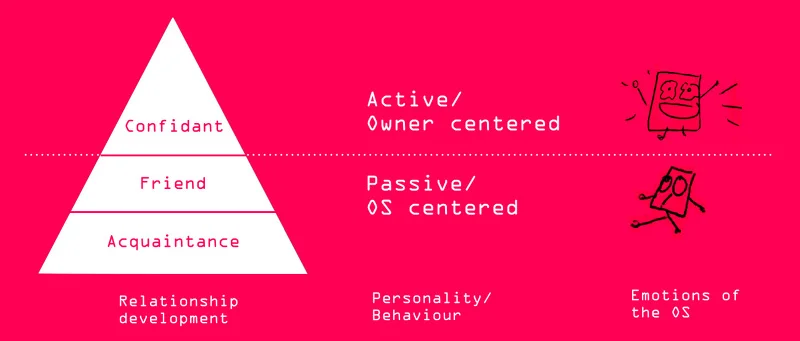
H.I.M is a personified O.S which can respond to different situations and express its emotions instantaneously through its Graphical User Interface in the future. It shows experimental scenario about how to expand ‘Graphic’ ‘User’ ‘Interface’ to ‘Graphic’ ‘Human’ ‘Relationship’.
Concept
H.I.M develops its personality by responsive interactions with its owner over time. It mainly responds to the owner's behaviour and attitude towards it; If the owner takes care of it well, it will become tamed and accustomed to him/her. On the contrary, if its owner treats it badly, it would have negative effects on its personality.
While keeping the responsive interactions, each device can have its unique personality and special relationship to the person who is not just using it, but has ownership of it.
Initial research
It began from a small inspiration, Gothscreenshots, collecting skeptical UI responds. The feelings of interface, which is even negative towards the owner, stimulated my curiosity. I started to research about what kind of emotions people experience on digital device and imagine the device's emotions.
Prototyping test
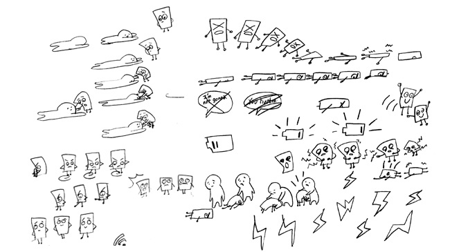
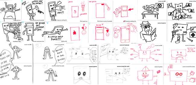
1. Paper prototypes
This is the one of the tool I made to test how people interact with emotional OS in the research process. I made 4 prototypes of personified device. From top left, the skeptical chatting, the absent-minded browsing, the helpless searching, and the lazy loading. To focus on personality of them, I removed function, but designed them only expressing negative emotion. I testes this with 4 people but, when the participants were hardly engaged with it because they couldn’t find why and how they interact with it.
2. O.S in contexts
To help people more engage and understand the personality of the OS, I tried again adding context about why they have the personalities. I tested with 3 children 10 to 13 again and it was much more successful. They were more engaged with the prototypes and it sparked additional stories on them. However, at the same time, I found that they need more detailed background stories for more complex level of interactions.
Co-creation. Memories of devices
I came up with an idea to use people’s memories, which is one of the most engaging and detailed story everyone has, and with 5 people co-created emotions of the OS based on participants memories of their own mobiles. Through the co-creation, I could get rich drawings of emotions of OS. And more importantly, I could find key insights that participants reflected their characteristics on the emotions of the OS, and that depending on how to use their gadget, each person created different types of relationships of the OS.
Emotions of OS interface exploration
01) Hand drawing
This is the first approach. People understood feelings from animations, but did not think of that this is emotions from OS but consider another graphical interface.
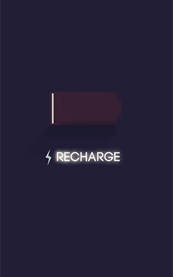
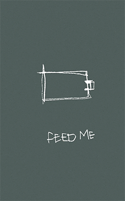
02) Flat GUI
It was similar results with hand drawing. People focused on feature of them, and even tried to manipulate them.
03) Message
I sent this animation the people who doing facebook in the midnight and ask them what they felt. In the case of using text to directly say what the OS is feeling, people were engaged emotionally; mostly they said like "you're annoying", "It's sweet". But they thought of that it's a kind of alarm application especially for the clock icon. Still it could not change their perception that this is a kind of the graphical interface.
04) Human-inspired behaviour
For the last, I used the metaphor of human-inspired behaviour.
It was successful most because people naturally connected the animations to their own situations, and understand 'what OS is feeling'
Final prototyping test
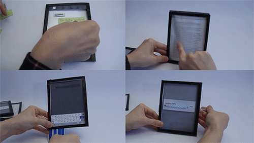
Based on the human-inspired behaviour metaphor, I created variations in 4 different situation and tested with 2 teenagers and 2 children. I drew the situation on paper with NFC tags, made a tablet to read the animations of the situation. And the below video is the brief of process and key insights from it.
In the test, testers emotionally engaged with OS. Interestingly even they put their emotional behaviour that they usually do to their friend or other people onto the OS. But the main reason of the emotional reaction were came from their own demands or interest and it was hard to see they were care about OS itself. However, They could adapt new way of interactions quickly and naturally repeated the new- learned interaction. Especially I found younger kids were proud themselves a lot when they had emotional feedback from OS. It shows positive possibility to next level of communication after the acquaintance level.