Myoungeun Kim

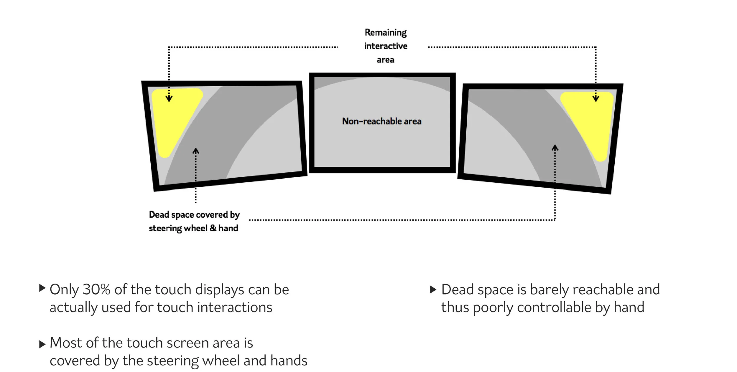
Multi-modal travel booking Post MVP strategy

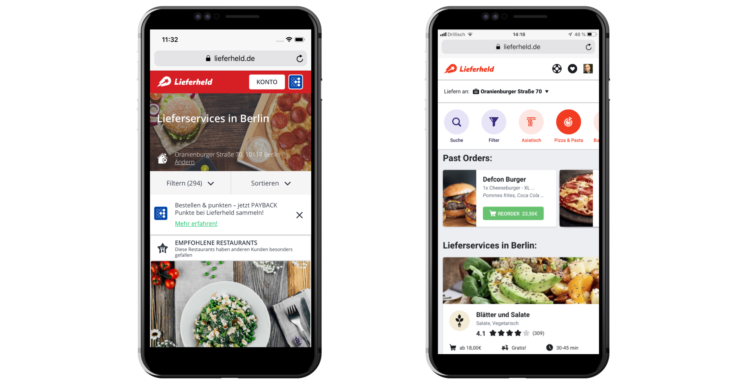
Omio is a digital platform that user can book tickets of Train, bus and flight. In 2019, Omio launched the MVP of the multi-modal travel booking that enables to buying different transportation mode tickets in one time booking experience. It provides user with the best way to travel between A to B when no good direct ticket option is available. From the business perspective, it fills the inventory gaps with uniques inventory, which drives the booking conversion increase.

Project Goal

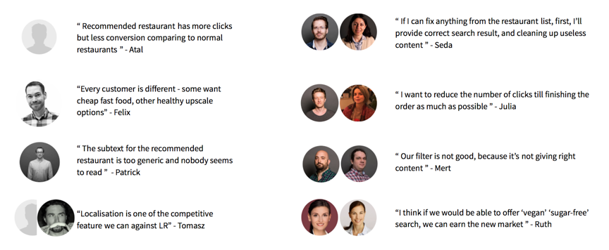
The biggest challenge of the project was the lack of the understanding of how MVP flow actually work throughout the booking process. Even though the MVP had successfully launched, it was hard to approach to the scale-up strategy of the feature that has multiple touch points across 3 tech teams that own each booking funnels. Therefore, the teams needed a consolidate strategy that gives clear directions on expanding to the other use cases and enhance the usability to 3 teams.

My Role

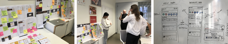
In 2021, I joined the project right after the MVP launched. I was part of a project to improve our strategical position, identify the UX frictions & make everything work straightforward. I worked with 3 teams of engineers, PMs and marketing and CS, leading the design process from the initial kick-off to final delivery.

More details will be continued soon
Thumb_05.png

Restaurant list Redesign for Lieferheld

Lieferheld is one of the most popular food delivery apps in Germany. As a product designer in the discovery team of the product, I led the research and shaped the product strategy together with PO. During the strategy development, I concepted the features and shaped UI/UX and developed it as the comprehensive wireframe by repeating user tests and internal stakeholder interviews. Currently, it’s on the state of development for the final release. 


Goal

Metrics showed that Lieferheld had issues to convert customers - especially new customers, from Restaurant List to Menu. It showed lower CVR than average from other countries in Delivery Hero and 8 % lower than the another entity from Delivery Hero Germany. Our goals was focused on to improve CVR and mCVR on the restaurant list iOS, Android and web by redesign UX/UI. 


Research | Qualitative data

01.png

Because of the low mCVR, it had been redesigned many times in silo of the each teams that divided based on clients. Transforming team set up as the use stage based, I joined ‘Discovery’ team and had a chance to approach the issues with holistic point of view. I looked through 15 previous A/B tests and external user tests over the year. Along with the review previous research, we conducted 2 external user tests on general use flow to observe the user one step behind.


Research | Qualitative data & Market research

02.png

With data anlythics, we went across the current mCVR, CVR and click rates for features on the pages and analysis the impacts and potentials of them. Also, we researched on our competiters to understand current and upcoming standards in the market and where our product is standing. 


Concept | Co-creation workshop

03.png

Based on the findings from the research, with other product designers, we had 2 co-creation sessions. Within the focused time, we could exchange ideas quickly and generated the initial prototype for the following concepts.   


Concept | Prototyping

05.png

1. Alleviate the visual distractions

WHY Because of poorly arranged elements on the big header image, users feel lost when they enter the page because they find hard where to interact first and how to proceed to the next step.

WHAT By changing the header color to white and removing the header image, the restaurant contents can be displayed on the first glance.


2. Provide direct access to Restaurant finding features

WHY Both new users and returning users who interact to features such as cuisines category or filters, tend to bring better CVR, although the click rates of the featurs are less than 5%

WHAT We developed the idea to put out the features upfront with a compact swimlane to help user accessing the features directly.


3. Past order swimlane 

WHY About 70% of Lieferheld users shows the tendency of sticking with the same menu from the same restaurant.

WHAT With 1-click button to create a basket from the restaurant list, we tried to reduce the steps to create the order for the returning users.


Evaluation | Stakeholder interviews

04.png

 To validate the concept and develop them as concrete features that works for across the departments, I shared the concept and collected the opinions from the internal stakeholders from CEO to SEO. Besides, collaborating with the user researchers, we ran 2 extenal user test with the low and high fidelity mockups. 


Evaluation | Low-fidelity prototype testing 

06.png

 To find insights from the user, I created the quick click-dummies and card sorting activities. We tested them with 5 extenal users and got positive feedbacks on the feature swimlane idea in general. Moreover, through the card sorting activities, we could find the best possibilities of the item placement and order and visualisation.


Evaluation | Hi-fidelity prototype testing 

07.png

 As the second iteration, I created 3 differnt high fidelity mock-up of the swimlane and tested with external users. The test results showed the firm confrimation for the new features but could not tell the final winner from the different concepts. We decided to choose one concept that has less hassle to run qucik A/B test.


Deliverables | Web A/B test 

Currently, it has been running on A/B test.

Thumb_01.png

Futuristic racing car HMI UX/UI Concept & Development

This is the project to design HMI UI/ UX of the client's first racing car brand. It is designed to enable passionate amateur racers to enjoy seamless driving experience on track, on road and on Xbox. It is aimed at rebranding the whole company from the most affordable to the tech-leading by engaging deeply into new entrepreneur culture in India. 

The automotive is first released in public in Geneva motor show 2017 and will make its debut in the market in late 2017 with detail service design implementation by Microsoft. 


Key User story

Taking the contextual dynamics between speed-focused on track use case and safe-focused on road use case into the consideration, we developed as two separated HMI modes with different feature sets that meet drivers' needs the best in each context. In the road mode, the driver should be able to access infotainment features with interaction that require driver's intention. On the other hand, in the race mode, the drive should be able to enjoy immersive driving experience andbe guided of racing tricks without being disturbed while driving. Based on the directions, I defined 15 key detailed use case to have a concrete pictures on the possible interaction scenarios on each situations.  


Hardware setup analysis

HMI design team kicked into the car project after the development of vehicle interior design by stylists in Turin. Inspired by surround monitor setup in the simulation gaming, it was the triple screen setup,- 2 touch screens on side, 1 non-touch screen in the centre. We started from the ergonomic analysis on the screen use and found out it brought out 3 main UX issues. They are as followings:

1. Disconnected screen use

2. Limited ergonomy on touch interaction

3. Limited interactivity on interface 


Prototyping process

We built a lot of prototypes through the process from very simple paper prototypes to a virtual seating bug. It helped to move forward to the next steps quickly by the proven evidence, and made the outcome concrete. 

Key Design solution

1. Layout structure

Taking all these requirements, trying to translate them into interface ideas, the overall architecture & structures together with appropriate interaction patterns. The structure of the HMI is defined with focus on UI optimised for the driver's focus view, quick & easy control and space efficiency.To optimised for the split screen setup, we simplified the mental model of UI structure by putting different contents types into each screens: Right screen is infotainment, centre screen is driving information, left screen is car settings.

When centre screen is used as full screen, the elements are transited to side screens and make organic space use over all screens. 


2. Ambient light

One of the key highlight of this HMI is 'Ambient light'. It is the simple indication with light & colour, specially designed to maximise utility of space that is caused by the steer wheel. It is used for the interaction that gives simple and quick feedback. 


3. List layout

The structure of list is optimised for in-car use. Quick scroll widget that is activated by touching edge of the screen, naturally nudges user to stand his/her hand on the frame while tapping the touch screen and allows the driver to have more stable use. Media list is combined with media control, therefore wider space is allowed for buttons. 

Quick scroll


Thumb_04_05.png